Design Sprint
PostUp
Customized search results
Experience tailored search results, organized by proximity and presented in a convenient list format. With PostUp, users have the ability to customize their preferences and amenities, ensuring a productive workday.
Communicate with Others
Map or List View
PostUp offers the flexibility to switch between the map and list view according to your preference. Whether you prefer a visual repression of location or a list of options, we've got you covered. The choice is yours.
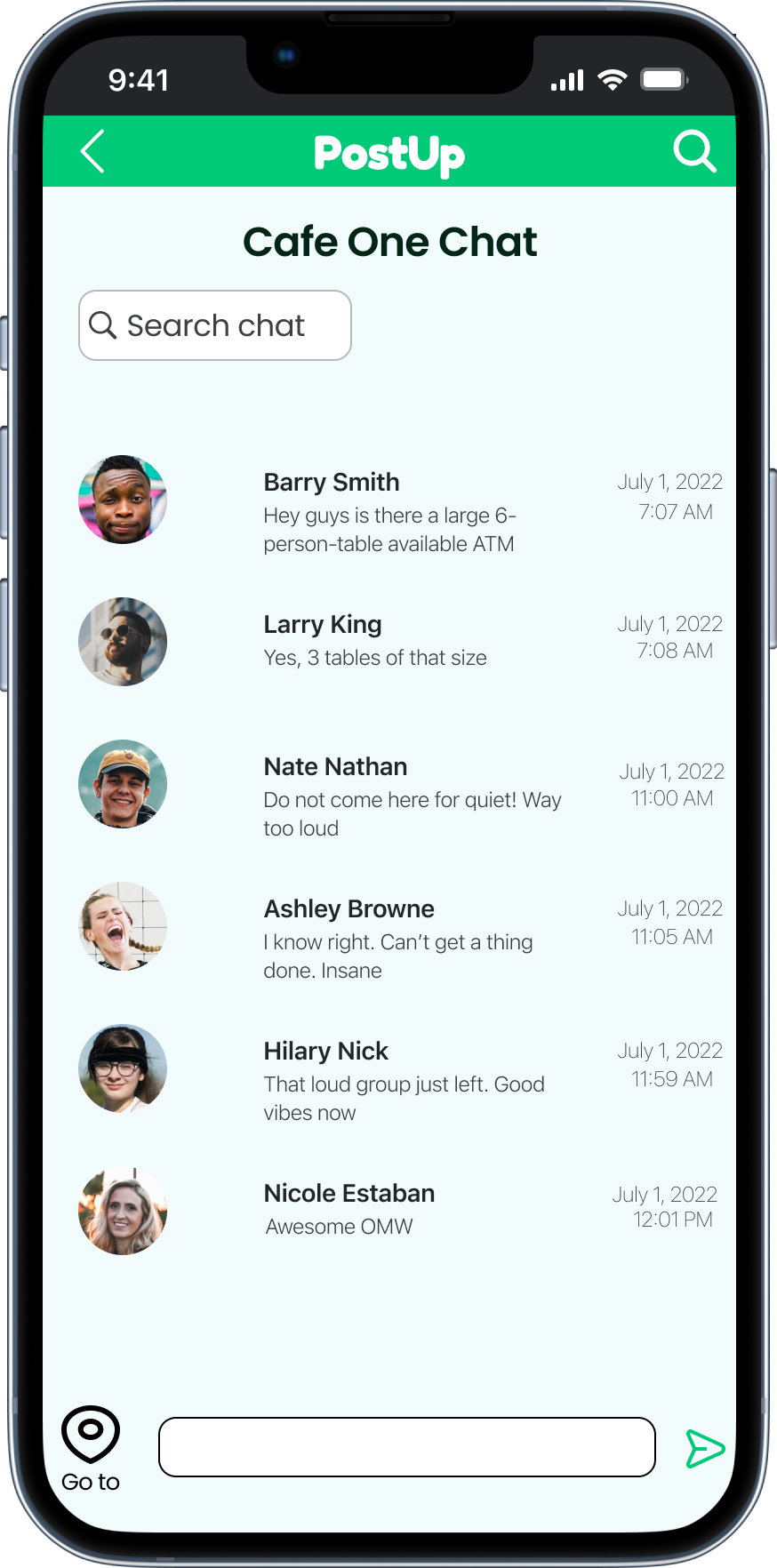
Stay informed with real-time information. Prevent disruptions by connecting with other remote workers who are already at your desired location to inquire about seat availability and noise levels, ensuring a seamless remote experience.
GOAL
Make it easier for remote workers to find great public places to work from.
THE ISSUE
As remote work continues to gain traction in today's working environment, many remote workers are faced with the challenge of finding suitable locations to work from. The needs of remote workers can vary greatly, including access to Wi-Fi, electrical outlets, bathrooms, proximity to current location, quiet spaces, and meeting areas.
THE SOLUTION
During a focused 5-day design sprint, develop a user-friendly function within our app that enables users to swiftly identify workspaces tailored to their specific needs.
DESIGNER ROLE
As a sole designer, I played a pivotal role in leading 5-day design sprint with a team to create a functional Minimum Viable Product (MVP). My focus was on developing an efficient solution that allows users to easily identify and select suitable workspaces.
Day 1 - Understanding The Problem
Research Highlights:
What is important to remote workers?
Good wifi
No noise
Crowds
Distance from where user is
Bathrooms
Outlets
Bonus, coffee food
Popular places others go to work (reviews?)
Multiple pictures of working space
Spends 3 days traveling for client meetings and remote work
Struggles to find suitable workspaces in unfamiliar locations
Needs to find places to work and take calls during breaks between meetings
Persona
Libraries are not ideal for taking calls, limiting suitable workspace options
Relies on Google search for nearby coffee shops
Prefers using map view for easier visualization
Considers distance from current location as an important factor
Examines photos to assess layout and table spacing, prioritizing spaciousness
Frustrated by the abundance of food-focused photos that don't provide helpful information
Checks operating hours and "busy time" indicators on Google and Yelp
Desires real-time seating availability information
Reviews are a valuable source for determining amenities like WiFi, outlets, and bathrooms
Searching through reviews is time-consuming and inefficient
Switches between multiple sites and apps during the search process
Most reviews are focused on dining experiences rather than suitability for work
Mapping
Leveraging research insights, a solution emerged — an app feature that would:
Empower users to locate suitable workspaces based on their preferences
Enable users to customize search criteria such as noise level, WiFi availability, and crowd size
Enables real-time messaging to checked-in workers for up-to-the-minute information
Nina: 32yo Freelance Copywriter - Boston, Massachusetts
About:
Goals:
Optimize work time by minimizing the search for suitable workspaces
Prioritize places with essential amenities for efficient work
Seek out quiet and spacious locations suitable for meetings and calls
Key Interview Insights
Chosen User Journey:
Frustrations:
Nina wastes valuable time searching for workspaces instead of being productive
Encounters the disappointment of inadequate amenities in chosen workspaces, leading to frustration and wasted effort
Multiple end-to-end journeys were sketched out before finalizing the optimal user journey.
I selected the last mapping example as it efficiently meets the user requirements in a structured manner. The primary and crucial step is the screen where the user specifies their search criteria. The results page is then presented in an organized manner by proximity. The user can then select a location, review pictures and comments, engage in communication and finally utilize the map for navigation to the destination.
Day 2 - Sketching
Lightning Demo
While conducting research on the availability of applications for remote work, it was noted that there were limited options. Workfrom emerged as the primary competitor to PostUp, offering features such as a comprehensive map, check-in functionality, and the ability to filter search results. The ability to view results as a list or map is particularly useful. Additionally, customer reviews were utilized to present results, which is a crucial aspect. Inspiration can also be drawn from similar apps such as Yelp and Foursquare, which utilize a color scheme predominantly consisting of blue and red. The utilization of icons by Yelp and Foursquare will prove beneficial for users in terms of accessibility and ease of use.
Workfrom
Yelp
Foursquare
Crazy 8’s
To explore layout possibilities, rapid Crazy 8's sketches were created within a strict 8-minute time frame. This brainstorming exercise facilitated the generation of diverse ideas on paper.
Solution Sketch
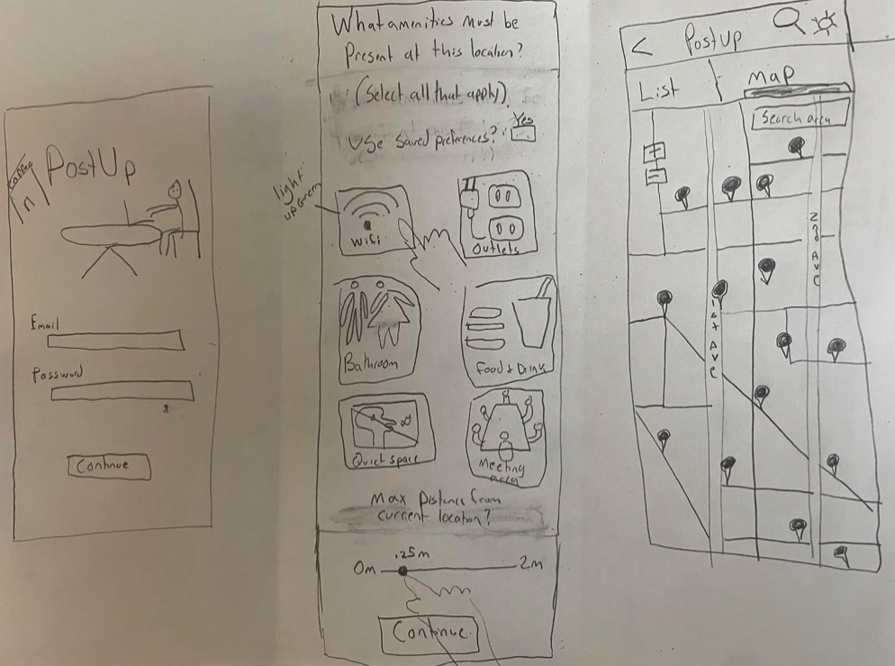
The central screen was chosen as the key interface for identifying remote work locations, offering customizable search options for precise results. The initial onboarding screen was removed to streamline the user experience. To showcase the value of the paid service, a preview of benefits was incorporated. The map with results screen was initially implemented but later revised to a list format based on user feedback, enhancing usability.
Day 3 - Storyboard
Reflection on Solution Sketch:
After reviewing my Crazy 8s sketches, I have decided to implement my proposed solution sketch due to its comprehensive approach to addressing the needs of the users. The design includes icons with accompanying text descriptions of essential amenities, as well as the option to prefill saved preferences for enhanced efficiency. Additionally, the screen features a sliding distance bar, allowing users to specify a maximum distance radius when in a time-sensitive situation.
Storyboard
The storyboard begins with the user selecting desired amenities and maximum travel distance for finding a productive workspace. Results can be displayed either as a map or a list, based on user preference. Users can then choose a specific location to view its description, including photos, ratings, contact information, and reviews. Additionally, a chat function allows users to join real-time conversations about the location, providing information on crowd and noise levels, as well as seating availability. Once a location is chosen, users can access directions and have the option to check-in or indicate their preference not to be disturbed.
Day 4 - Prototype
The proposed solution for PostUp provides comprehensive amenities and user-friendly interface. The initial screen prioritizes convenience by letting users select necessary amenities and max distance. The Sign-up page is required for revenue generation. Once signed up, users see a list of locations viewable as a map or list, organized by proximity. Clicking on a location shows information on ratings, reviews, hours, address, phone number, and photos. Users can "go to" the location or access the chat feature with real-time info on crowd level, tables, and noise level. Upon arrival, users can check in or remain anonymous. Usability testing aims to evaluate the amenities screen, user preference for results display, and information priorities on the results page.
Day 5 - Validate Design
I interviewed five individuals who have experience working remotely or studying in public locations. Out of the five participants, three have previously worked remotely, and two have completed university coursework in public locations.
Participants expressed a desire for an application of this nature. Some of the findings were surprising, while others were consistent with expectations. Overall, participants found the application to be user-friendly, though they did provide feedback on areas for improvement
Usability Testing
Users desired the ability to edit amenities directly on the screen, eliminating the need to navigate back to the home screen for modifications.
2. Users overwhelmingly preferred “List view” to “Map view”
3. Lastly, participants were particularly fond of the in-app chat feature located within the destination information screen, which they found to be a useful tool for obtaining up-to-date information.
Conclusion
Final Design:
Recap:
Streamline your remote work experience with PostUp.
PostUp has created a convenient application to address the challenges faced by remote workers in finding suitable nearby locations with essential amenities. Our app eliminates the time-consuming search process, allowing users to quickly discover ideal workspaces for a productive day. With real-time information on seat availability, noise levels, and more, users can make informed decisions. The app also provides various viewing options to accommodate individual preferences.
Takeaways:
Future Steps:
User interviews are crucial for understanding user preferences and needs
Timing and approach for introducing the charge fee should be carefully considered
Providing a comprehensive preview of app features before asking for payment may be more effective
Conduct more usability testing in international locations to understand remote workers' needs and preferences.
Perform user testing to evaluate the understanding of app icons and consider improvements in icon design.


